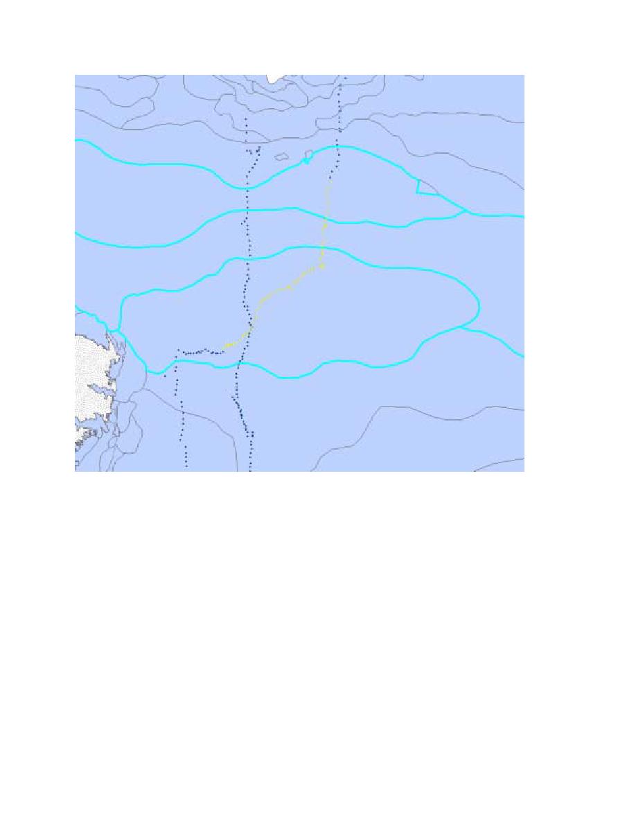
Figure 5. Zoom in view of temporally and spatially coincident ship-based observations (yellow)
with a weekly ice chart polygons highlighted in cyan.
Comparison of NIC Ice Charts and Ship-Based Observations
Figure 6 shows the scatter around the one-to-one comparison line with error bars for each
coincident multi-point, ship observation and NIC polygon. Overall, the NIC ice charts tend to
underestimate ice thickness, particularly thinner ice. A temporal bias is evident in May, and
especially June of 1998, with the ice charts underestimating the thickness. The random scatter of
this plot results in a relatively low correlation (0.6). A similar comparison was made during the
decay season from December through February. We are currently examining outliers on this and
other scatterplots to understand mismatches in measurement abilities between these two data
sets.


 Previous Page
